Brand: Indika
Scope: Branding, strategy
Year: 2021
Location: Chandigarh
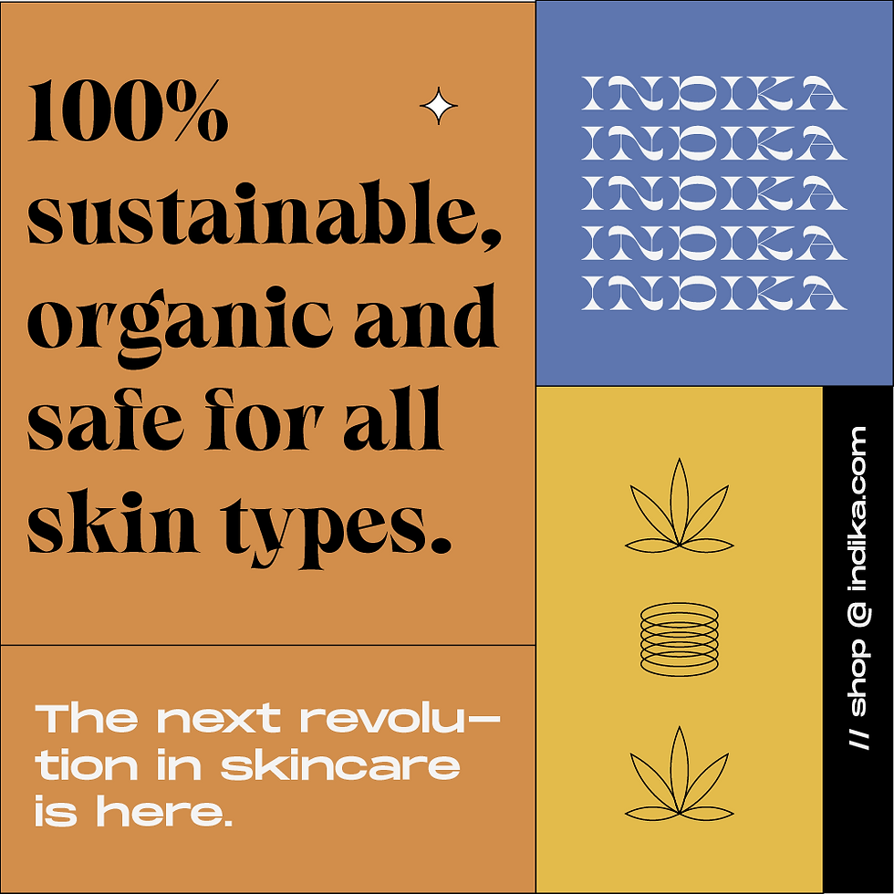
Indika was an experiment. Nobody knew if hemp skincare would work. The brand had to appear familiar and friendly. It doesn't take a PhD to infer that this was a sign for us to go the retro, neo brutalist way, does it?
Promotional teaser with animation for Indika
Indika was an unusual challenge when they approached for a branding overhaul in that they were obviously concerned with marijuana but could not explicitly express it (law, remember?).
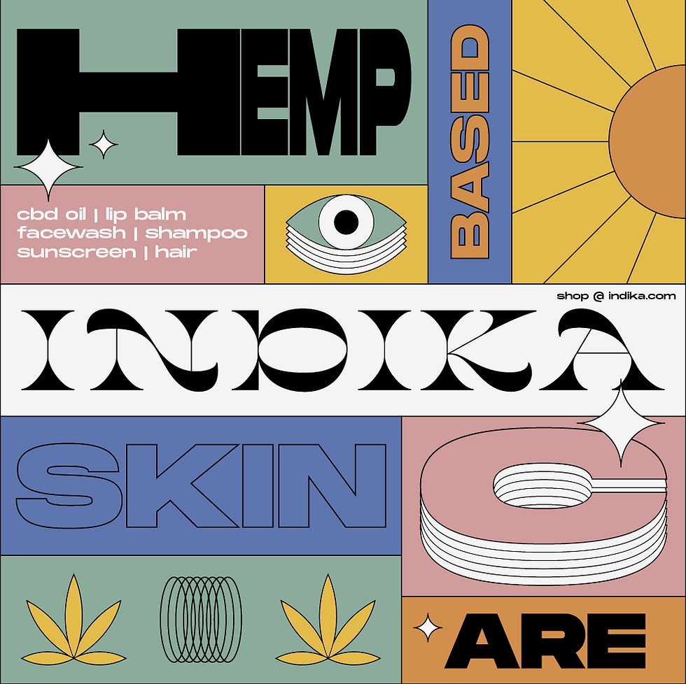
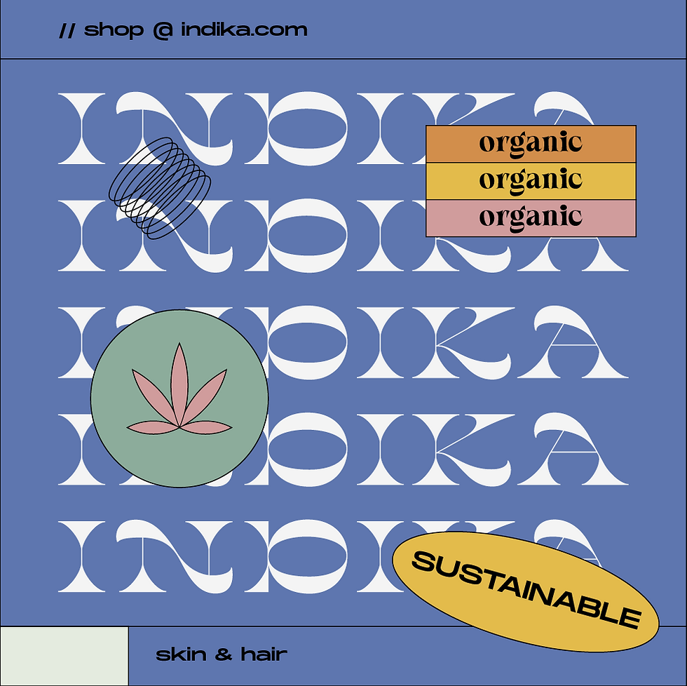
Typography was the way to go, undoubtedly, because we couldn't symbolically represent hemp in any way whatsoever. A wordmark was created and along with some retro, pastel colours to make it appear old and familiar, we had our first range brand extensions- psychedelic, trippy design elements (including a marijuana leaf, because apparently you can't use it as a logo but can use it elsewhere).
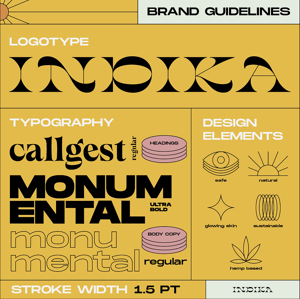

It was all experimental- the design, I mean. Because I hadn't really tried this style before and as I already said, the brand had an uncertain future given the (political) circumstances concerning marijuana, for both recreational and industrial use.
As I look back on this, I of course dislike it, as I do all my old works. But the fact I tried something like this at that point in my career really is something of a flex!

