Brand: Rasa
Scope: Branding, typography, packaging, strategy
Year: 2022
Location: Nepal
I've never once stepped out of India. And here I was, working right out of scratch on a brand with an ancient heritage that was alien to me. One of my longest WIPs ever, stakes were high as it was my first project at a new job. Safe to say, I've never again underestimated the importance of research in my branding projects ever since.
Rasa as a concept just drew me in when I was first briefed about it. Who wouldn't want to be a part of the first luxury, artisanal mithai brand in Nepal? The name had hundreds of years of history in it. The identity needed to show at least 10% of that.
Having never visited Nepal, I paid extra attention during my research. I read extensively about the religious symbolisms and especially the paintings of Nepal. One artwork in particular struck my fancy. It was the Mandala of Chandra, God of the Moon dated late 14th - early 15th century (see below).
The Mandala of Chandra, God of the Moon
Also, the word 'Rasa' was derived from the concept of 'Navarasa' - the 9 emotions or states of mind. And this painting had the number 9 in its core. Do you notice the 9 deities surrounding Chandra? This painting was a gold mine.
I started with the hand mudras. Chandra's 'vaahans' served as a design element too. The chariot's design was another inspiration behind packaging.
Further design elements were taken from another beautiful traditional Nepalese Paubha painting of the Hindu God Shiva being enshrined, dated from the mid 18th century.
Elements like the multiple arms in the central figure of this painting (a recurring theme in Hinduism) and the other deities sitting in their intricately patterned windows around the painting were also used.
A Paubha painting of Shiva enshrined
Rasa was a unique project in the sense that the packaging was created first and the logo unit came to be later. And it made sense because of how deeply symbolic the packaging was to the Nepalese culture. Its elements served as a guide for other design extensions like the logo mark, the menu etc.
The logo mark is a symbolic rhododendron flower that is a national and cultural representative of Nepal. Its 9 spokes refer to the concept of 'Navarasa' that Rasa was born out of.
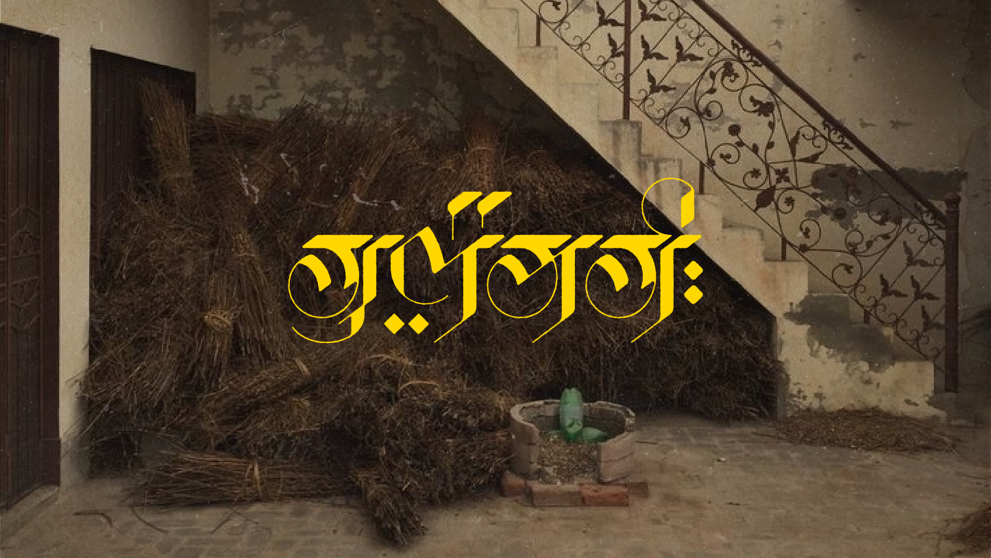
The wordmark is a customised type with letterforms modified to incorporate elements of the Devanagari writing system (notice the "ः" 'visarga' after the last letter).
Packaging, product inserts and the ribbon
Some initial rough concepts for Rasa
Sketching the logo unit
The design for the packaging was originally made for a square box. However, more dimensions were added later on and the design system with its use of independent elements and motifs were flexible enough for me to quickly rearrange them for varying sizes without drifting too far away from the original vision.
The packaging design (above) and the digital menu (below)
Letterhead (A4)
